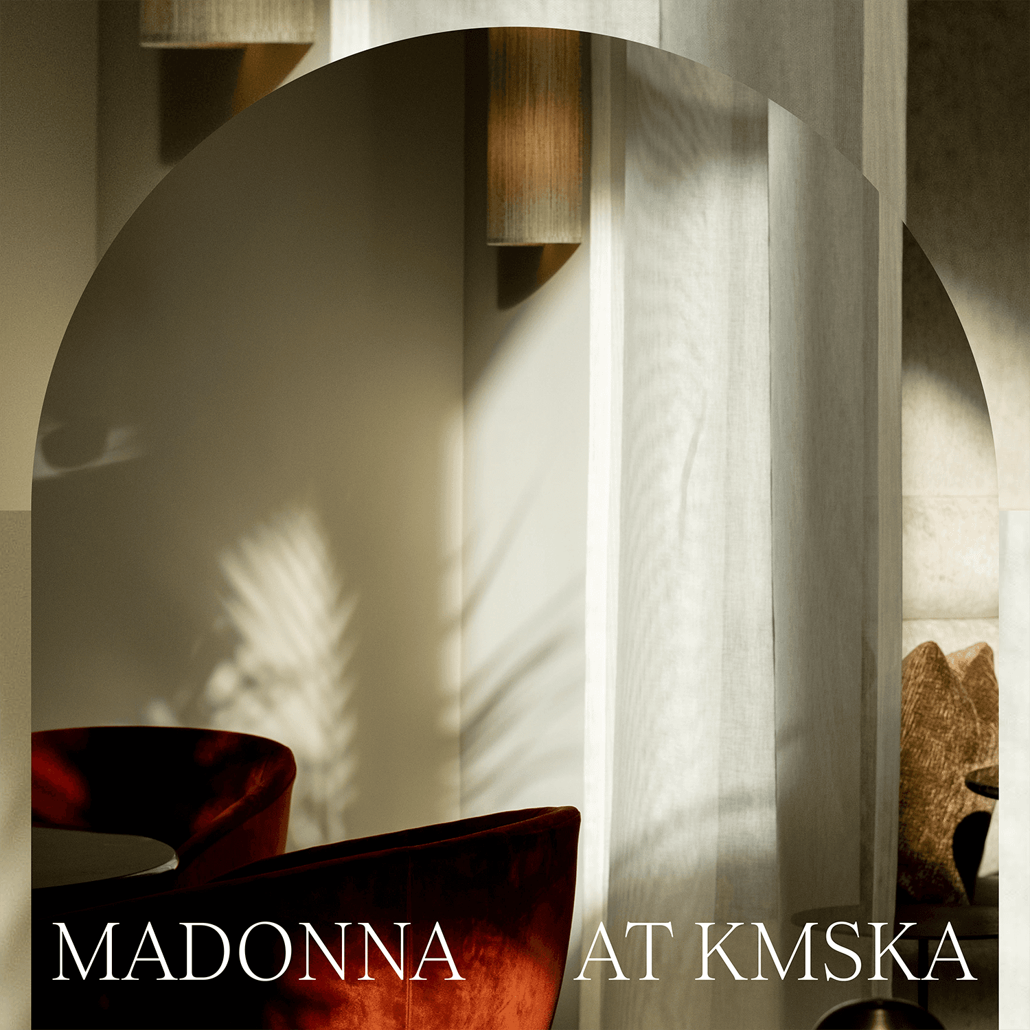
Madonna at KMSKA
CLIENT
Madonna at KMSKA
SERVICES
Strategy Branding,
Webdesign
INDUSTRIES
Hospitality
Madonna is er voor zij die genieten van een snelle hap, lunch of een verfijnd diner, vergezeld van een heerlijk glas wijn, streekbier of een lekkere koffie.
Voor Antwerpenaren én dagtrippers. Voor de kunstliefhebbers en de bon vivants. Kortom, Madonna is er voor iedereen die schone momenten verzamelt.

GOAL
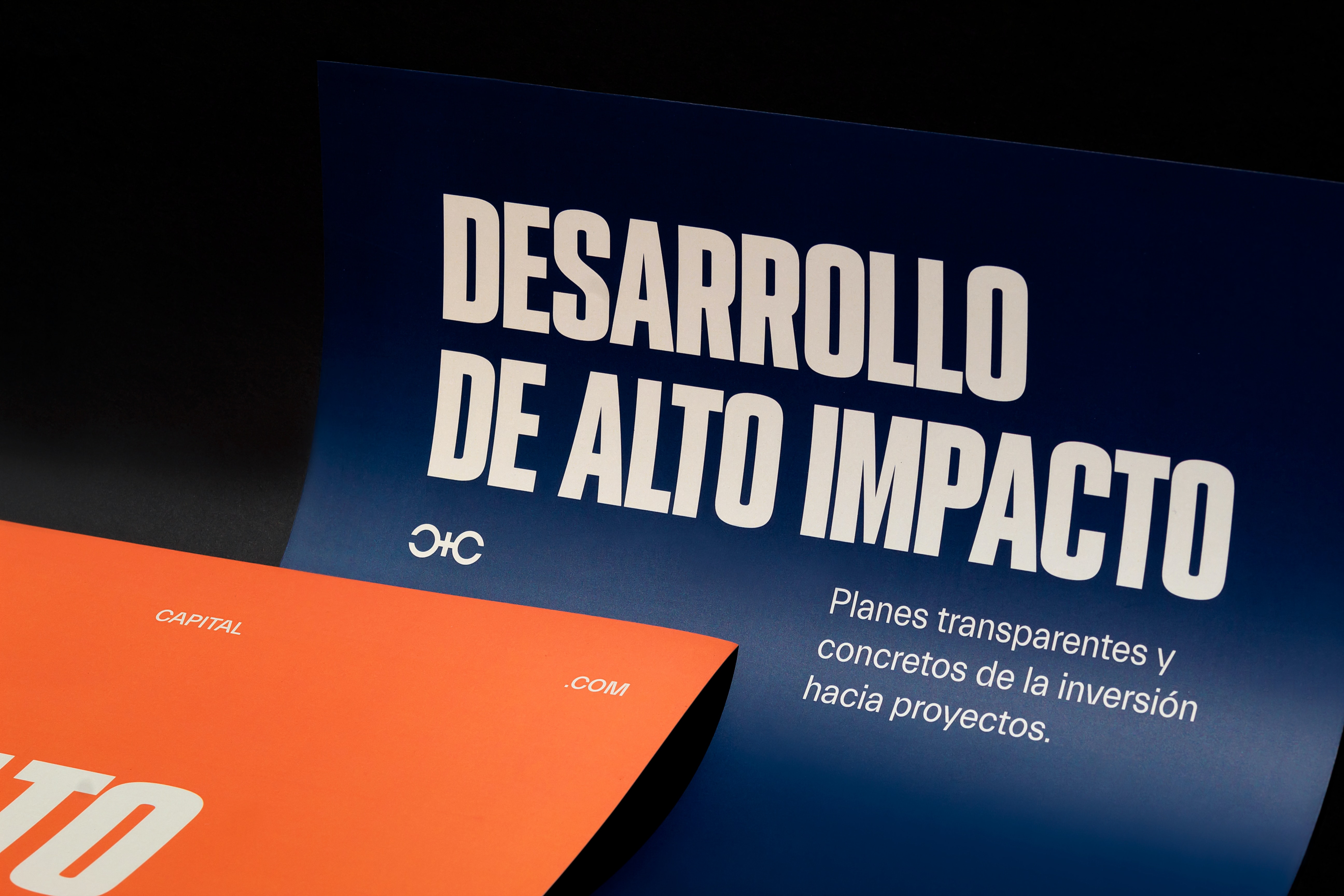
Castro Capital wanted to be seen as a powerful, respected, yet close, trustworthy partner. We were looking for a mixture of minimalism and power and elegance that looks into the future and reflects itself as someone you can count on
SOLUTION
Inspired by luxury, we created a monogram which represents the two "C's", portraying them in a symmetrical and elegant design. They are joined together by the "+" symbol, speaking for the contributions they make to their projects and investors. The letter "R" and "P" stand out due to their style, positioning a high-quality concept. Simple details that help distinguish Castro Capital from the competition. More than textures, the brand uses a unique way to distribute its visual elements based on geometric shapes, highlighting typographic hierarchies and filling empty spaces with minimalist elements to compliment the visual frame.


